We hope StoryXpress is helping you create the best sales videos ever.
Okay, you created a convincing video, explained the problem nicely, pitched how your product or service helps solve the problem and flaunted all the essential features, and then concluded the video.
Something seems to be missing, right?
Now, you would want to make your users take some action.
Be it giving you their contact information or booking a free trial with you.
It is easy to do it in a blog post but how do you do it in videos?
That’s where StoryXpress CTAs come in handy for adding cta on videos
If you want them to book a meeting with you, visit your landing page or check out your social media handles, you must escort them.
And, how do you do that? By using compelling call-to-actions.
Strategic CTAs are crucial to guide the users through the buyer’s journey.
This guide will help you understand how to add CTAs to your videos.
Let’s begin!
What is Video Call To Actions
Video Call To Action (CTA)or video CTAs serves as a vital catalyst in prompting viewers to engage in a specific action. Be it a verbal or visual component, or even a combination of both, a CTA is meticulously crafted to steer the audience towards desired behaviors, such as exploring a website, subscribing to a newsletter, initiating a purchase, or sharing the video with their network.
When executed proficiently, a CTA has the potential to significantly enhance viewer engagement, amplify conversion rates, and ultimately drive your marketing or communication objectives to fruition.
Adding CTAs to Your Videos With StoryXpress
Before you start, if you’d like to revisit what CTAs are, why they’re crucial and what the different kinds of CTAs are, here is a quick guide to help you.
A CTA doesn’t always have to be a button. There are various types of CTAs ranging from buttons and banners to lead generation forms and booking meetings.
However, depending on your target audience and the type of message that you want to convey, you need to decide which CTA is apt for you.
StoryXpress provides you with multiple options to add CTAs. Catch them real quick here.
Let's understand how they can add value to your sales using video cta.
Not creating sales videos yet? Create your first video now!
Buttons
A button is generally ideal for cases where you want to redirect your prospects/viewers to another landing page.
Buttons don’t stop your videos altogether and appear in a certain part of the frame, like this:
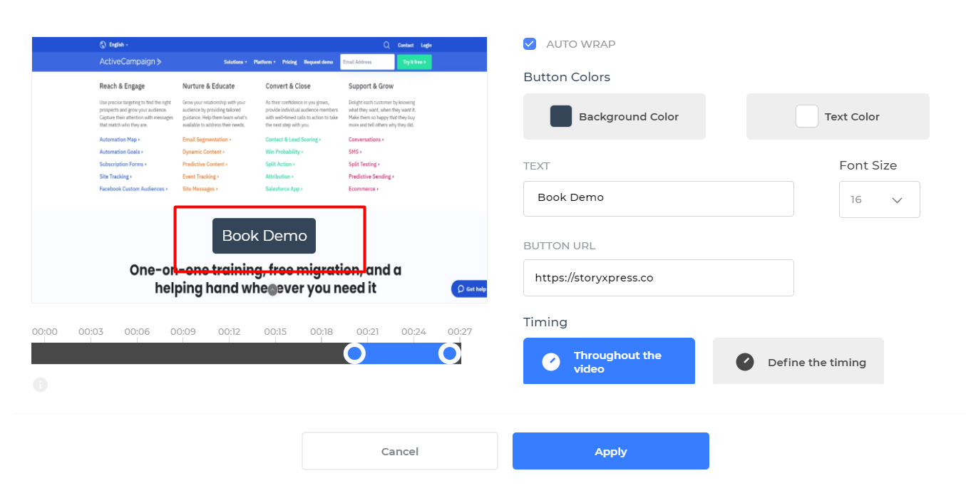
With StoryXpress, you can customize your CTA buttons the way you want.
You can choose the background color, text color, specify what the text would be along with the font size. Plus, you can add video cta on the URL the button would lead to.
And, you can specify the timing for the button CTA to show up. Either you can have it there throughout the video, or make it appear/disappear as per your wish.
Banners
The next kind of CTA that you can insert using StoryXpress are non-clickable banners.
Banners look like buttons but are usually static. They don’t lead the user to any other page.
You should use a banner when you have an audience seeking coupon, an offer or a general piece of information but you don’t want your audience to click on it or be redirected to any other page.
Banners are not clickable but you can customize them pretty much like buttons.
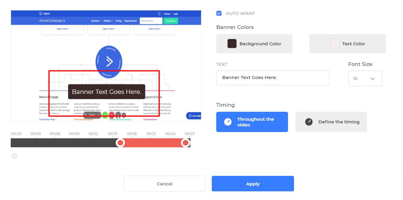
You can select the background color, color of the text along with specifying what text goes on the banner.
Additionally, you can play around with the font size and define the timing for the banner to show up. You can either have it throughout the video or for a specified time interval.
Lead Generation Forms
Lead generation forms allow you to collect your prospect’s contact information such as name and email address.
StoryXpress lets you insert forms in your videos to collect textual information such as names, addresses etc. You can also collect email addresses or phone numbers though.
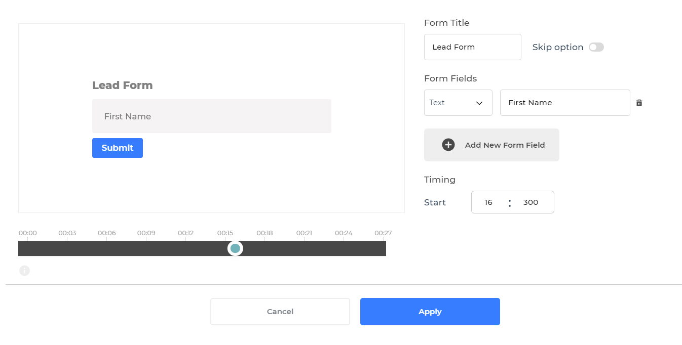
The viewers can choose to skip the form if you allow them to, plus you can specify the timing for the form to show up.
You can also integrate your StoryXpress account with a few leading CRMs such as HubSpot and ActiveCampaign to insert custom lead generation forms and see your leads directly in the CRM.
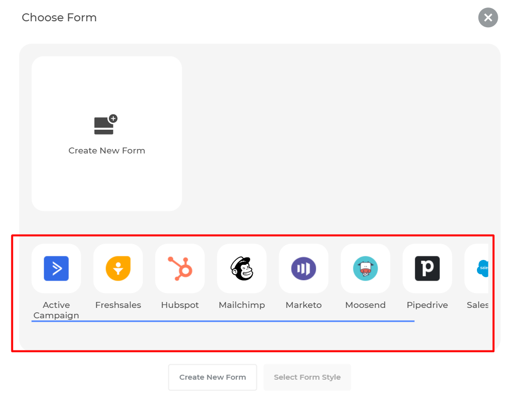
This will save you the time that goes into manually updating lead details in the CRM.
Calendar to Book Meetings
Finally, you can insert your calendar in the video when you want the lead to book a session with you.
For this, you either need to integrate your StoryXpress account with Calendly or Book Like a Boss.
Inserting your calendar generally comes in handy when you are already in touch with the lead and are sharing video content to nurture them.
It’s also important to note that the option to add CTAs in your videos is available for Pro and Plus Plan users only. If you are a freemium user, claim your free trial here or upgrade your plan to start using this feature. Explore all the pricing plans here.
How to Add Call-to-Actions in StoryXpress Videos
Adding CTAs to your StoryXpress videos is quite easy.
Go to your StoryXpress dashboard and click on ‘Videos’ to see all the videos you have uploaded or recorded.

Select the video you want to add a CTA to.
Once selected, you should see this.
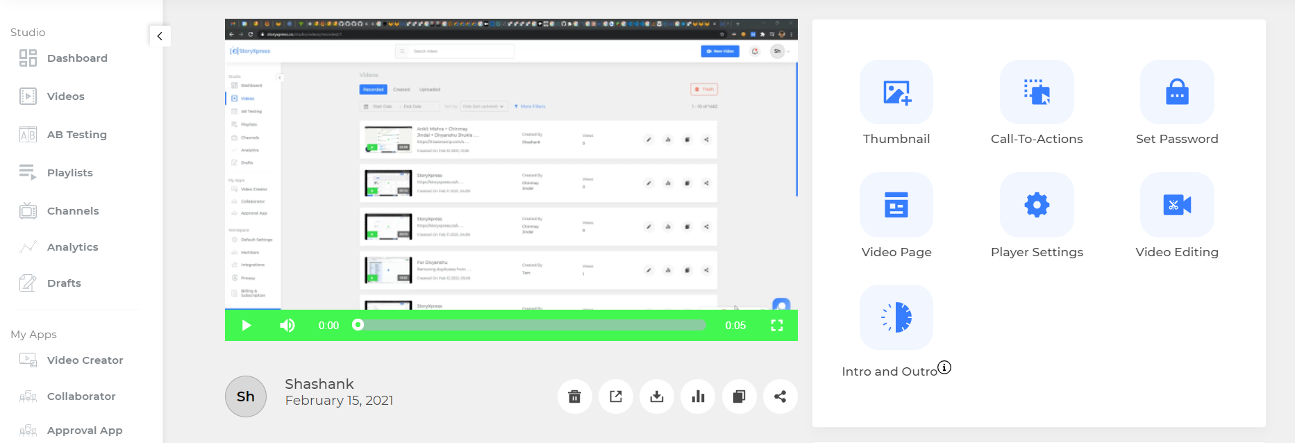
Click on ‘Call-to-Actions’ to see the various options available.
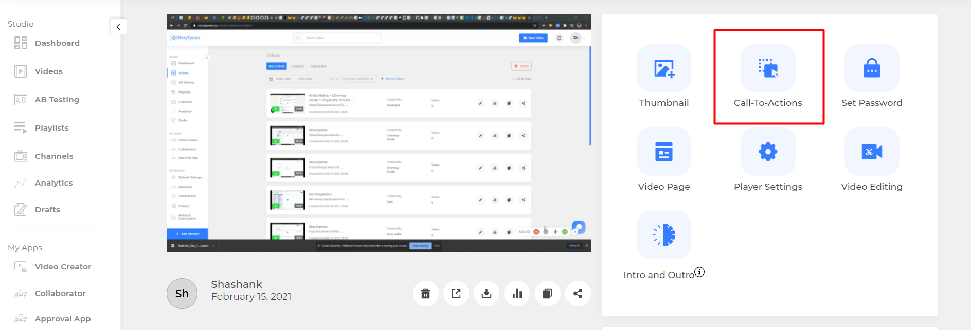
Clicking on Call-to-Actions should lead you here.
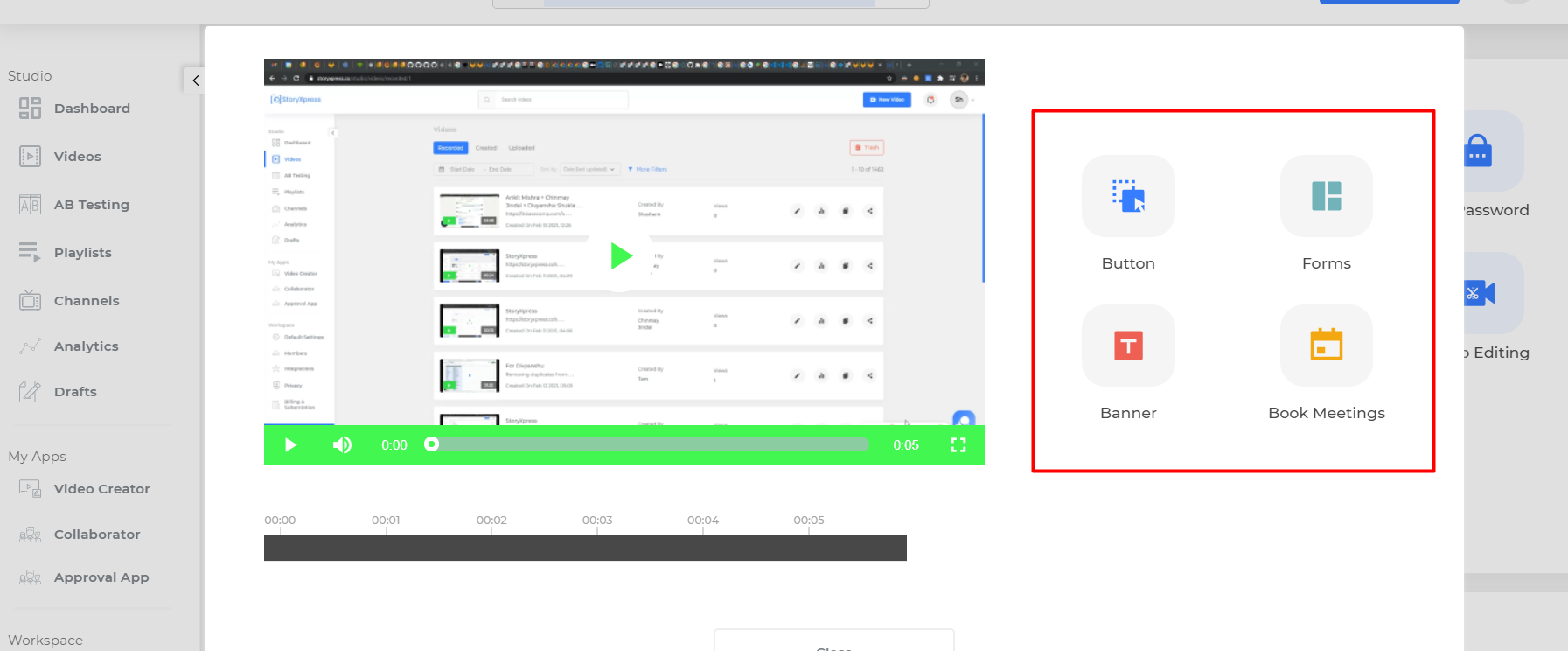
Here you can see the four different ways you can add CTAs to your videos namely buttons, forms, banners and booking meetings.
You can select any of these four options and add the required CTAs to your video.
For each of these, you can play with various styles, plus you can decide where the CTA appears in the video.
Where to Insert CTAs in Your Videos?
Although there are no rules for inserting CTAs in your videos, it’s important that you go by some best practices while optimizing your videos.
You can either place your CTAs at the very beginning of the video, in the middle of it or towards the end.
The placement of CTAs in your videos may not seem to make a lot of difference but in some cases, it can be the deciding factor behind a user responding to it or not.
Placing your CTAs at the very beginning of the video ensures that every viewer sees them and has an opportunity to click.
But when it is at the very beginning, your prospects don’t know if they should respond or not, if it is the right offer for them or not and are more likely to skip the CTA, or worse, stop watching the video.
Placing your CTAs in the middle of the video targets your viewers when they are engaged the most.
However, CTAs, after all, are an interruption and placing them in the middle disrupts the natural rhythm and flow of your video. This can ruin the user experience altogether and they may again not feel like watching the video till the end.
Inserting your CTAs towards the end of the video ensures the viewer is highly interested before being presented with a CTA. But, not every prospect will watch the video till the end and thus your CTA may have lesser reach than you expect.
What do you do now?
Depending on whether you are already in touch with the lead or not, you can strategically place your CTAs.
How to Place Your CTAs Strategically in Videos?
For instance, if it is the first time you’re contacting someone, it may not be a good idea to insert the CTA within the first few seconds of the video.
Having said that, there are cases where it makes sense to insert the CTA in the first half of the video.
For example, if you have launched a new feature, you can let the prospects leave the video and try it out or book a live demo with you, rather than watching the video till the end.
Likewise, if you want your prospects to book a session with you, it is a good idea to start the conversation in the video and request them to book a session with you to continue, towards the end of the video.
Lead Forms to collect preliminary user information for the first time, like name, email, phone number are better put after you have enticed the user enough but don't put them at the end of the video otherwise the user might bounce off.
If you would want to discuss more about our CTA options, please feel free to get in touch with our customer support team.
Eliminating the Guesswork
We just saw that there is no rule of thumb for where to insert CTAs in your videos, and it rather depends on what your goals and objectives are.
However, if you’re using StoryXpress, you can actually eliminate all the guesswork and uncertainty and have some concrete insights on where to insert your CTAs. How? By using video analytics!
For every video recorded using StoryXpress or hosted on StoryXpress, you can see a video heatmap that looks something like this:
You can use the heatmaps to understand how exactly the viewers are responding to your videos.
Thus, you can see what section of the video engaged them and where you can expect a favorable response to the CTA.
Video CTA Examples
Video CTAs play a crucial role in driving viewer engagement and encouraging specific actions. Here are a few compelling examples of video CTAs that effectively nudge viewers towards desired outcomes:
Dropbox: In their explainer video, Dropbox uses a simple and direct CTA, encouraging viewers to "Try Dropbox for free." This unambiguous message, combined with a clear visual representation of their product, prompts users to explore their service.
Old Spice: The popular "The Man Your Man Could Smell Like" ad campaign features a humorous video CTA where the actor says, "Ladies, look at your man, now back to me." This memorable and entertaining CTA creates a strong brand association and drives product curiosity.
Headspace: This meditation app's video content often ends with a straightforward CTA, such as "Start your free trial now." The CTA is visually accompanied by the app's logo, reinforcing the brand and encouraging viewers to try the app.
Dollar Shave Club: Their viral video, "Our Blades Are F***ing Great," features a charismatic presenter who walks viewers through the company's value proposition. The video ends with a clear CTA, "Shave time, shave money," and a button to join the club, effectively driving sign-ups.
Slack: In their product explainer video, Slack uses a CTA that invites viewers to "Discover a better way to work." This message focuses on the benefit to the user and sparks curiosity about the platform.
Charity: water: Their video campaigns employ emotionally evocative storytelling to create a sense of urgency and empathy. The CTA, "Join the movement," inspires viewers to contribute to the cause and make a positive impact.
Videos are one of the best ways to engage your audience. But, it’s crucial that you use the right strategy to convert that engagement.
Don’t leave it to your users to figure out what to do next. Guide them closely through the buyer’s journey and you’d definitely see an impressive surge in your conversion rates.
And yes, don’t forget to make your CTAs super compelling and attractive. Play with colors and see what resonates with your brand tone.
Write to us at support@storyxpress.co for quick, actionable help with any of our features.
Good luck!


 Free Screen Recorder for Chrome


